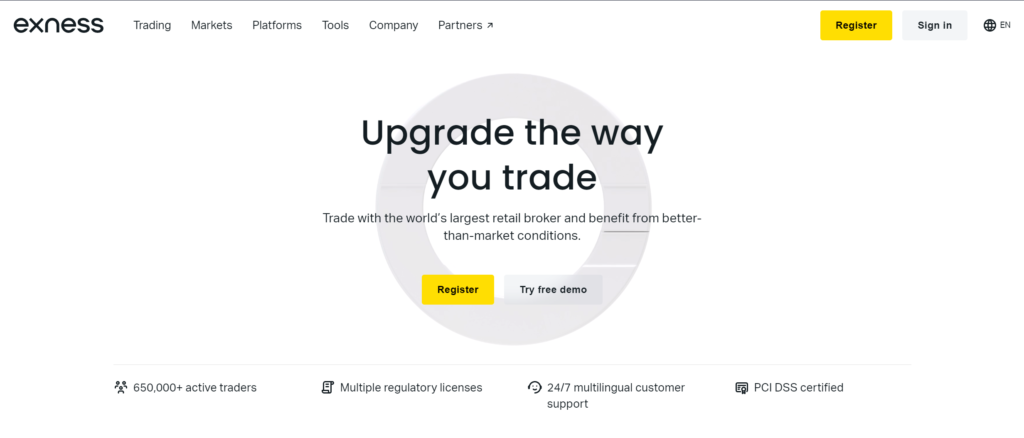
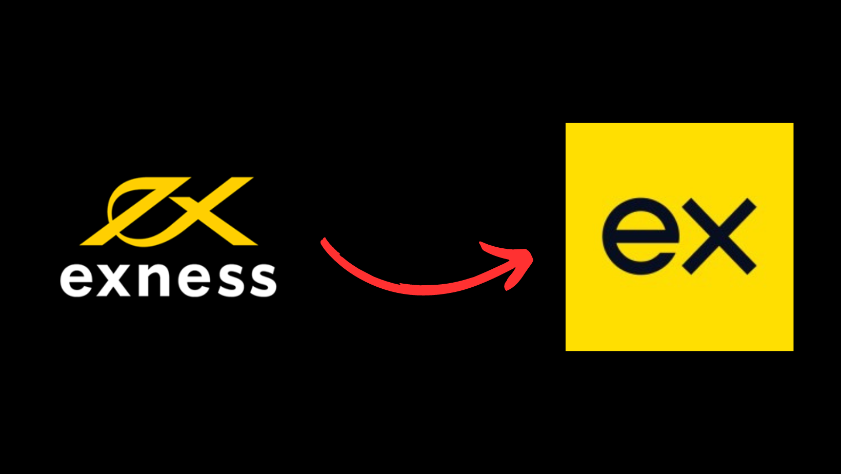
After 15 years in the market and breaking multiple records in its trading volumes, Exness has rolled out its rebranding. Framed as “taking the brand to the next level”, the change features the well-recognized handwritten style logo gone for good as it’s replaced by sleek modern lettering. The new website look sees decreased yellow, leaving it as an accent color.
Here’s the logic behind the new logo, as per the press release pushed by Exness this morning:
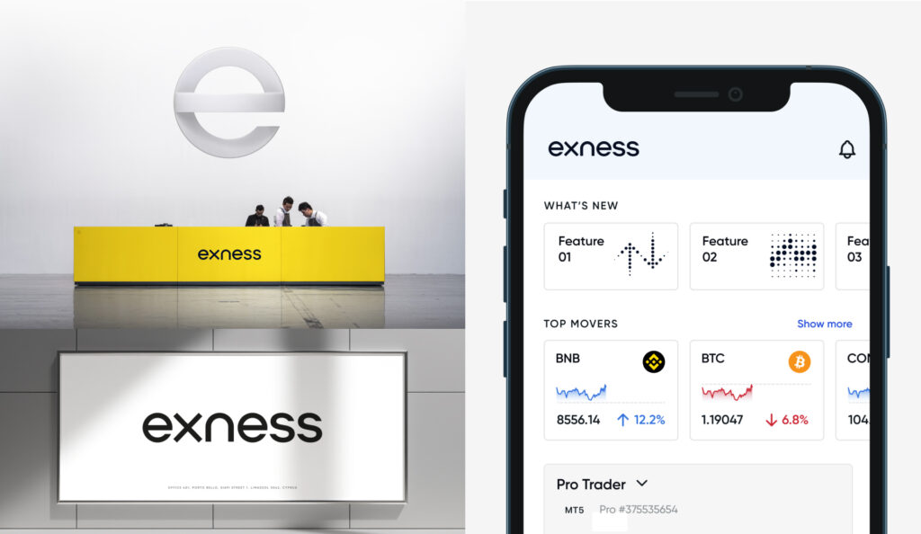
Featuring a new logo, defined by the distinctive exo emblem, the rebranding speaks to a sleeker, more modern design. Inspired by Exness’ recognizable initials, ‘e’ and ‘x,’ the exo embodies a fusion of head and heart, the mathematical and the human. These are the pillars which speak to Exness’ brand story and define the way it conducts business.
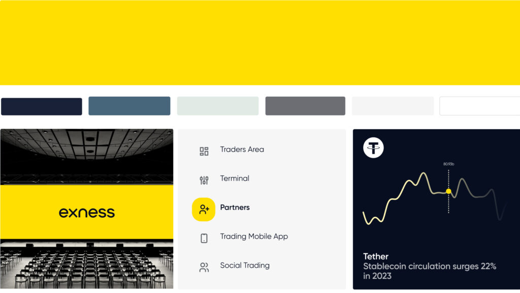
Carrying the legacy of the old logo, the exo also serves as a visual anchor, connecting the broker’s past achievements with its future vision, in this way honouring its legacy to forge its future. The brand’s font and colour palette have also undergone a makeover, featuring a more modern font and a brighter, bolder yellow.


visuals from the Exness blog.
Trendy 3D animations complete the look:
Exness’ new brand is clean and modern. And, admittedly, the previous look and feel could do with some updating. But is it truly next level? Is it unique? Is this the look that tells: Yes, we are the respectable market leader, bigger, bolder, more reputable and recognizable than any other forex/CFD broker in the world. We are NUMBER ONE. Does the new branding really say that? Do you think the style represents the world’s biggest and arguably most recognizable forex broker? Tell us what you think in comments here, and join our Facebook or Telegram to discuss.


